Forms are hard, they said
Forms are essential for any interactive web experience. But they are easy to mess up. See what makes a good form and how modern tooling can help systematically creating great forms.
Disclaimer: This post was originally a talk I gave at a Munich TypeScript Meetup with a mixed audience of designers and developers.
Forms are everywhere.
Forms are the backbone of interactive web experiences. Built into the HTML platform, they offer a ton of functionality and solid accessibility out of the box—yet they remain one of the trickiest elements to get right.
Let’s look at what makes a good form and how we can systematically create great forms.
What’s a Form?
The
<form>HTML element represents a document section containing interactive controls for submitting information.
— MDN Web Docs
Simply put, a form is a container for controls that collects user data and sends it somewhere. It’s the bridge for two-way communication between users and applications, whether that’s powering advanced navigation through query parameters or handling data updates like sign-ups or purchases.
Anatomy
A good form is a carefully structured system. Its key parts are:
- Form Element - The container that groups related controls.
- Labels - Clear text descriptions for each input.
- Controls - Interactive elements like text fields, checkboxes, or dropdowns.
- Validation - Rules to ensure the data makes sense.
- Error Messages - Feedback when something goes wrong.
- Submit Control - The button or trigger to send the data.
Here’s a basic example of a search form:
<form method="get" action="/search"> <label for="query">Search:</label> <input required type="text" id="query" name="q" aria-describedby="query-desc query-error" aria-invalid /> <p id="query-desc">Enter search terms</p> <button type="submit">Search</button> <p id="query-error">...</p></form>This example includes native field-level validation and error messaging. Aria Attributes inform screen readers about the field status and where to find label and descriptions.
Where the Platform falls Short
HTML forms are powerful, but most of the time you will end up building your own system. When you need dynamic behavior, advanced validation, or custom styling, the platform alone can’t keep up. You’ll run into limitations like:
- Complex Validation Logic - Think interdependent fields or server-side checks.
- Conditional Fields - Showing or hiding controls based on user choices.
- Custom UI Components - Replacing native elements with custom design, like error messages, dropdowns, date pickers.
- Form State Management - Keeping track of what’s changed or valid across the form and inform the user.
For example, at work I have a filter form where depending on the selected table and column we offer time, text or number based filter controls. Users must provide a minimum, a maximum, or both. Minimum values should be less than or equal to maximum values.
We could not create that with native HTML forms.
Replacing the Platform is Dangerous
This is where JavaScript steps in. But replacing native functionality with your own will break expected behavior. The platform is designed to be accessible. Browsers or extensions provide convenience on top of it.
When replacing the platform, we need to recreate or emulate native functionality.
The Form Experience
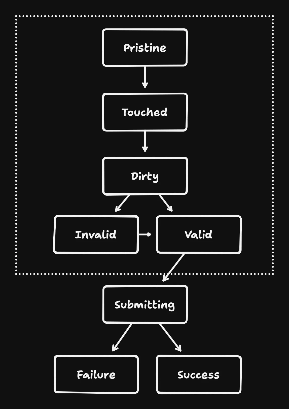
Forms aren’t static—they evolve as users interact with them. Here’s a rundown of their states:
- Pristine* - Freshly loaded, untouched.
- Touched* - A user has interacted with at least one field.
- Dirty* - Something’s been changed from its default value.
- Invalid* - At least one field fails validation.
- Valid* - Everything checks out.
- Submitting - Data’s on its way.
- Submit Failure - Something went wrong.
- Submit Success - Mission accomplished.
Each state may affect how the form looks and behaves, and managing that is no small feat. States with an asterisk will additionally apply to every form control.
Footguns everywhere
Take our simple search form with one field. To make it accessible and dynamic, you’ve got to:
- Wire up
labeltoinput(usingforandid). - Connect descriptions and errors via
aria-describedby. - Track state changes for the field (pristine, dirty, valid, invalid).
- Track state changes for the form.
- Style it based on those states.
- Handle errors by:
- Setting
aria-invalid. - Showing error messages.
- Updating
aria-describedbyto include the error. - Focusing the first invalid field.
- Setting
And don’t forget to avoid re-rendering the entire form on every keystroke or to catch typos in field names and ids.
These pitfalls make forms daunting, but thankfully, modern tooling offers a way out.
There is a Solution
Forms are everywhere, and these challenges pile up fast. How do we avoid cutting corners that accidentally hurt UX or exclude users? We need a system that builds on HTML’s strengths, ensures accessibility, scales to complex use cases, and plays nicely with custom controls.
Validation? Zod!
const formSchema = z.object({ username: z.string().min(2, { message: "Username must be at least 2 characters.", }),})Zod is a TypeScript-first schema validation library. It’s perfect for checking data from “outside” sources—like user inputs from the DOM or API responses. Define your rules once, and Zod ensures your form data meets them, with clear error messages ready to go.
Form State? React Hook Form!
const form = useForm<z.infer<typeof formSchema>>({ resolver: zodResolver(formSchema), defaultValues: { username: "" },})React Hook Form (RHF) simplifies state management. It hooks into your form, tracks changes, and pairs beautifully with Zod via zodResolver. You get validation and error handling without the boilerplate.
Accessible UI? Shadcn/ui Components!
Zod and RHF will get you far, but not far enough for the ergonomics. Controls, labels, descriptions and error messages still need to be wired up and orchestrated manually.
Enter a modern solution from ui.shadcn.com.
For those who are not yet familiar with shadcn/ui: It’s a blueprint for your own design system. They provide React components that you copy and paste into your repository and then become yours.
Their form components combine established libraries into a solid set of components that are composable and accessible by default. I’ve used it in the most complex forms and it didn’t let me down.
<Form> <FormField control={form.control} name="..." render={({ field }) => ( <FormItem> <FormLabel>...</FormLabel> <FormControl>{/* Your form control */}</FormControl> <FormDescription>...</FormDescription> <FormMessage /> </FormItem> )} /></Form>It’s a great learning resource for designing for composition, both the code and the design.
Let’s break it down.
The Recipe
Here’s how it works under the hood:
<Form>: A reexport of RHF’s FormProvider to share form state via context.
<Form> // 👈 React Context for the Form State</Form><FormField>: Wraps RHF’s Controller to manage individual fields. It adds another context that will allow us to access the field name.
<Form>    <FormField // 👈 RHF Controller + React Context for name      control={form.control}      name="..."      render={({ field }) => (
)} /></Form><FormItem>: Generates unique IDs for accessibility and provides it via context.
<Form> <FormField control={form.control} name="..." render={({ field }) => ( <FormItem> {" "} // 👈 generates & provides input ID via Context // access everything via a hook here </FormItem> )} /></Form>useFormField Hook: Accesses Form, Fieldname and ID context. It granularly subscribes to updates of the field and generates ids for the description and error message. By throwing if the contexts are not available it can enforce using every wrapper accordingly.
const { id, name, formItemId, formDescriptionId, formMessageId, ...fieldState} = useFormField() // 👈 throws if Contexts are not present<FormLabel>: Uses the hook to automatically set the correct for=… attribute for accessibility. You can also change the appearance of the label based on form or field states.
<Form> <FormField control={form.control} name="..." render={({ field }) => ( <FormItem> // 👇 automatic for=... <FormLabel>...</FormLabel> </FormItem> )} /></Form><FormControl>: Automatically forwards id, aria-describedby, aria-invalid to the actual control that will be its children. You don’t have to do this yourself anymore when building forms. The children will be focused when validation for this field fails.
<Form> <FormField control={form.control} name="..." render={({ field }) => ( <FormItem> <FormLabel>...</FormLabel> // 👇 sets id, aria-describedby, // aria-invalid on the control automatically <FormControl>{/* Your form control */}</FormControl> </FormItem> )} /></Form><FormDescription> and <FormMessage> automatically have IDs matching the ones in the aria attributes of the control. Here you can also configure appearance and styling based on the state.
<Form> <FormField control={form.control} name="..." render={({ field }) => ( <FormItem> <FormLabel>...</FormLabel> <FormControl>{/* Your form control */}</FormControl> // 👇 id matches aria-describedby <FormDescription>...</FormDescription> <FormMessage /> // 👈 only appears when invalid </FormItem> )} /></Form>The Result is Composable
The components can be used for different types of fields. When used as a checkbox, the order can be changed to have the checkbox on the left and label, description and error message stacked on the right.
<FormItem> <FormControl> <Checkbox checked={field.value} onCheckedChange={field.onChange} /> </FormControl> <div> <FormLabel>...</FormLabel> <FormDescription>...</FormDescription> <FormMessage /> </div></FormItem>This setup tackles the foot guns head-on:
- Accessibility: ARIA attributes are handled for you.
- Validation: Errors appear consistently, tied to Zod’s rules.
- Performance: The form does not slow down as it gets more complex, because rendering is isolated to the field.
- Type Safety: Catch typos for field names at compile time with TypeScript.
It’s flexible enough for complex forms. Conditional fields, custom controls, field arrays can all be solved by utilizing RHF directly. Even custom styles for special cases can be handled with class merging.
Forms are hard, but they don’t have to be.
With this approach we can stop wrestling with form quirks and focus on shipping great software.
By combining HTML’s foundation with tools like Zod, React Hook Form, and React Context, we can tame form complexity while delivering a seamless, inclusive user experience.
While shadcn/ui uses zod and RHF you could create a similar set of components with other schema validation and form libraries.